
AI Image 2 remodelează fluxurile UI/UX
Mock-uri dashboard și mobil; predare în Figma.
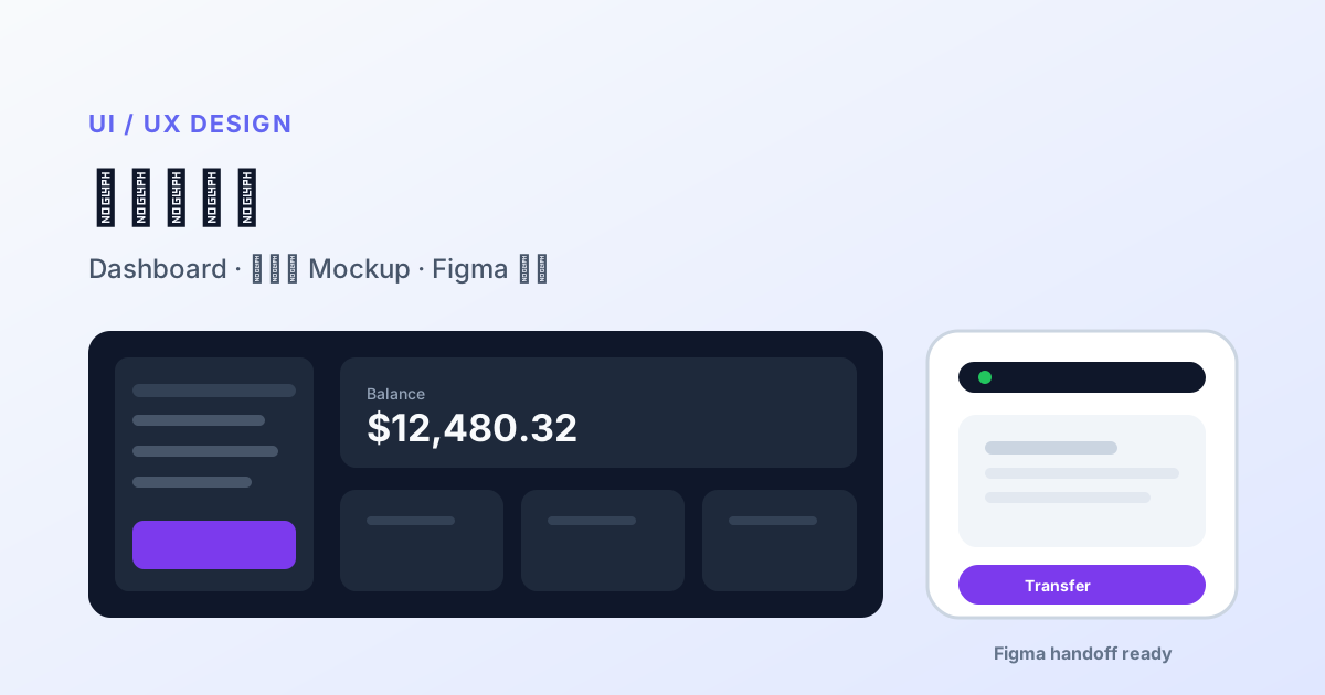
Designerii fac mockuri dashboard și mobil înainte de Figma.
- 16:9 sau 9:16, componente numite.
- Inter / SF Pro, cifre între ghilimele.
- PNG → Figma ca wireframe.
Thinking reduce etichete ilizibile pe UI dense.
Product designers lose hours aligning vision instead of polishing pixels. AI Image 2 in 2026 is widely used for version-zero hi-fi: credible App screenshots, SaaS dashboards, and chart cards before meetings — so PMs and stakeholders debate real layout, not gray wireframes.
Why UI mockups are hard — and what changed
Classic AI fails UI with fake buttons, broken grids, nonsense chart numbers, mixed icon styles. AI Image 2 improves:
- Dense UI element placement obedience
- Small label readability (nav, KPIs)
- Thinking mode plans sidebar + top bar + cards before render
- Multi-aspect (16:9 desktop, 9:16 mobile) for one design language
Output is still raster — review assets, not production vectors.
Design process map
| Phase | Use | Deliverable |
|---|---|---|
| Discovery | mood + competitor style | direction boards |
| Concept review | 2–5 dashboard options | projector review |
| Usability prep | key task screens | static flow before clickable proto |
| Design system | ❌ not pure AI | needs vector library |
| Dev handoff | ❌ not replacement | Figma dev mode |
Prompt templates
SaaS dashboard (dark)
B2B SaaS analytics dashboard, dark #0F172A, left sidebar icons, top search bar,
4 KPI cards (MRR, Active Users, Churn, NPS) with realistic numbers,
12-month revenue line chart, recent transactions table right,
Inter-like sans, 16:9 desktop screenshot.
Mobile finance (light)
iOS finance home, 9:16, white, bottom tabs Home/Invest/Cards/Profile,
hero balance "$12,480.32", Transfer/Pay actions, 3 transactions with icons,
SF Pro style, status bar, rounded cards.
Chart panel
Grouped bar chart Q1–Q4 sales by region, readable axes, corporate blue, 1:1 slide style.Iteration
Keep layout; change primary to brand green #10B981; collapse sidebar to icons;
KPI third item → "Trial conversion rate".
Figma collaboration
- Export 2× PNG for zoom review.
- Import as 30–50% opacity reference in Figma.
- Trace with real design-system components.
- Color tokens from Figma variables — not AI hex.
- Ship vector frames only to dev.
Typical: 3–5 days → 1 day from brief to reviewable hi-fi.
Thinking strategy for UI
| Task | Mode |
|---|---|
| Single-screen exploration | Instant |
| Copy + charts + tables same screen | Thinking medium |
| Onboarding 1–4 screens | Thinking, generate per screen |
Design QA (10 min)
- Nav spelling correct
- Chart numbers plausible (replace with real data)
- Consistent iOS vs Material — don’t mix
- Safe areas / notch
- Contrast rough eyeball only — tool-test formally
Limits
No hover/error/empty states; responsive breakpoints need separate prompts; each image may micro-drift — use component library at scale; don’t leak unreleased features into public API.
One-week sprint
| Day | Activity |
|---|---|
| Mon | PM user stories + metrics |
| Tue | AI Image 2 — 3 desktop directions |
| Wed | Pick direction, mobile variant |
| Thu | Figma rebuild + proto link |
| Fri | 5-user test |
Conclusion
AI Image 2 is an accelerator, not a replacement. Use it for alignment; Figma for delivery. When stakeholders first argue over a screenshot that “almost clicks,” the ROI is one fewer meeting — not just saved render cost.